Guidelines
All features will be 6 to 10-page spreads. Interview questions are provided and space is planned in the layout for it. Interviews that are too long might be edited down to fit the space in the print issue, but the full interview will be posted on the website blog, giving you more visibility and reaching a larger audience. If you do not have time to answer the questions, an artist statement can be sent. But keep in mind your page count might go down if we do not have enough text for the layout.
If your entry is a photographic editorial it can have a title, (please provide one) If you do not provide a title we will use your name.
The images should be either all from the same shoot, or work that is from a collection or body of work. If you are an artist it would be pieces you would hang together in a show, if you are representing a designer, it would be a seasonal collection. If you are working with a wardrobe stylist, then it would be focused on color, theme, period, or style. There should be a unifying aspect to your entry.
Featured artists will have a spread of 6 to 10 pages which will include an interview or artist statement, and they have the option of requesting a cover. The images which are chosen when the theme is curated depend on the overall content of that issue. We try to choose work that goes well together. When you are invited you will be sent a sample set of images which we would like to publish. If they are available and you agree, then just follow the instructions for submission in the invitation. If the images chosen are not agreeable for any reason, if it is older work that no longer represents your style, or you have a new body of work you prefer to have published, please send samples to the curator Nina Pak and she will consider if they will fit with the current theme. Samples should be 800 pixels on the long side sent to her e-mail as attachments, not a zip file. At this time inclusion in Miroir is by invitation only. We do not have the staff to oversee a submissions process. Hopefully, in the future, we will have more resources and the ability to open the submissions to a wider audience, we know we are missing out on many great artists, please don’t take it personally if you have not been invited yet. Join our social media sites and let us get to know you.
If your contribution is for fashion, you should have at least two complete wardrobe changes for each model, featuring multiple outfits from one designer or multiple designers. If you are representing designers, we would like to have the credits for the garments used, please make a list, and give the designers for each of the items. For example: Garments by so and so, Headpiece by this one, accessories by that one.
If the wardrobe is the models own, or vintage, or if a stylist has pulled garments from someone’s closet, then there is no need to provide the label information. We are more interested in fashion that is in some way unusual: wearable art or Avant-Garde. It can be made of recycled items as long as it is artistic.
Communication and careful planning is key for your editorial to be published. We want to ensure that we have credited everyone on your team, so a list of the models and your styling team is also required. If we do not have this information, we will have to write you to request it, which means it will take longer and your submission may not get included by our deadline date.
Your editorial should tell a story, or have an interesting theme. On the average we favor themes where the models are doing things which are out of the ordinary, something different or dramatic, romantic or surreal.
All features (6 to 10 page spreads) should have an interview, if you do not have time to answer the questions, an artist statement can be sent. Keep in mind your page count might go down if we do not have enough text for the layout. If your entry is a photographic editorial it can have a title, If you do not provide a title we will use your name.
Image Size Specifications:
8.25″ x 10.75″ Trim size This is final size of the magazine.
Your images should be 2550 pixels wide by 3300 pixels long. For a double page spread they should be 5100 pixels wide. Save them as JPG with Quality set to Maximum
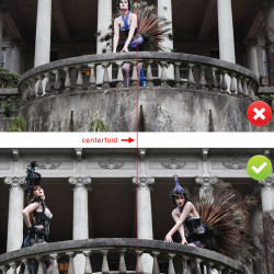
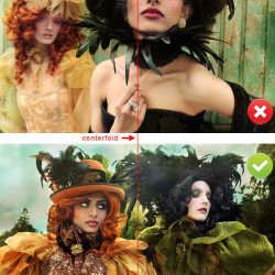
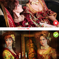
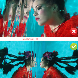
The Trim size can vary slightly in either direction, so full page images should fill the bleed area, While any important details should be inside the safe zone. This means hands, fingers, toes, tops of heads, or anything else that is important, that you would not want to be cropped off. So please keep this in mind when creating your edits and do not crop too close, leave a little room around the image for bleeds. Nothing of importance should be in the centerfold area for the double page bleeds, when shooting and editing for the magazine keep the models to either side of the center line. Please see the attached images for clarity on this point.
Color space can be RGB or CMYK.
For double page spreads, here are some samples of what is not ideal / ideal or don’t / do
The photographs by Nina Pak, Designers and issues they were published in:


